Industry
Mobility, transport and logistics
Fair
InnoTrans, Berlin
Size
1.058 m² and 1.519 m²
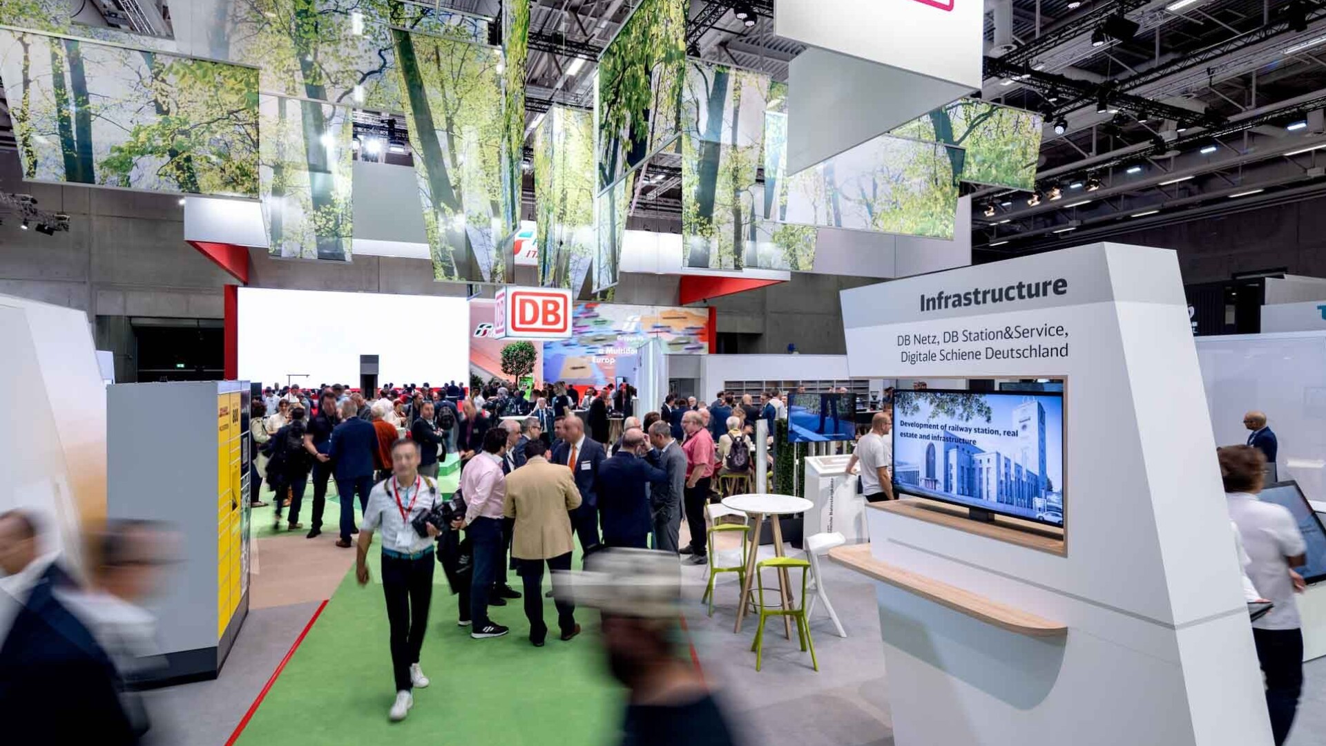
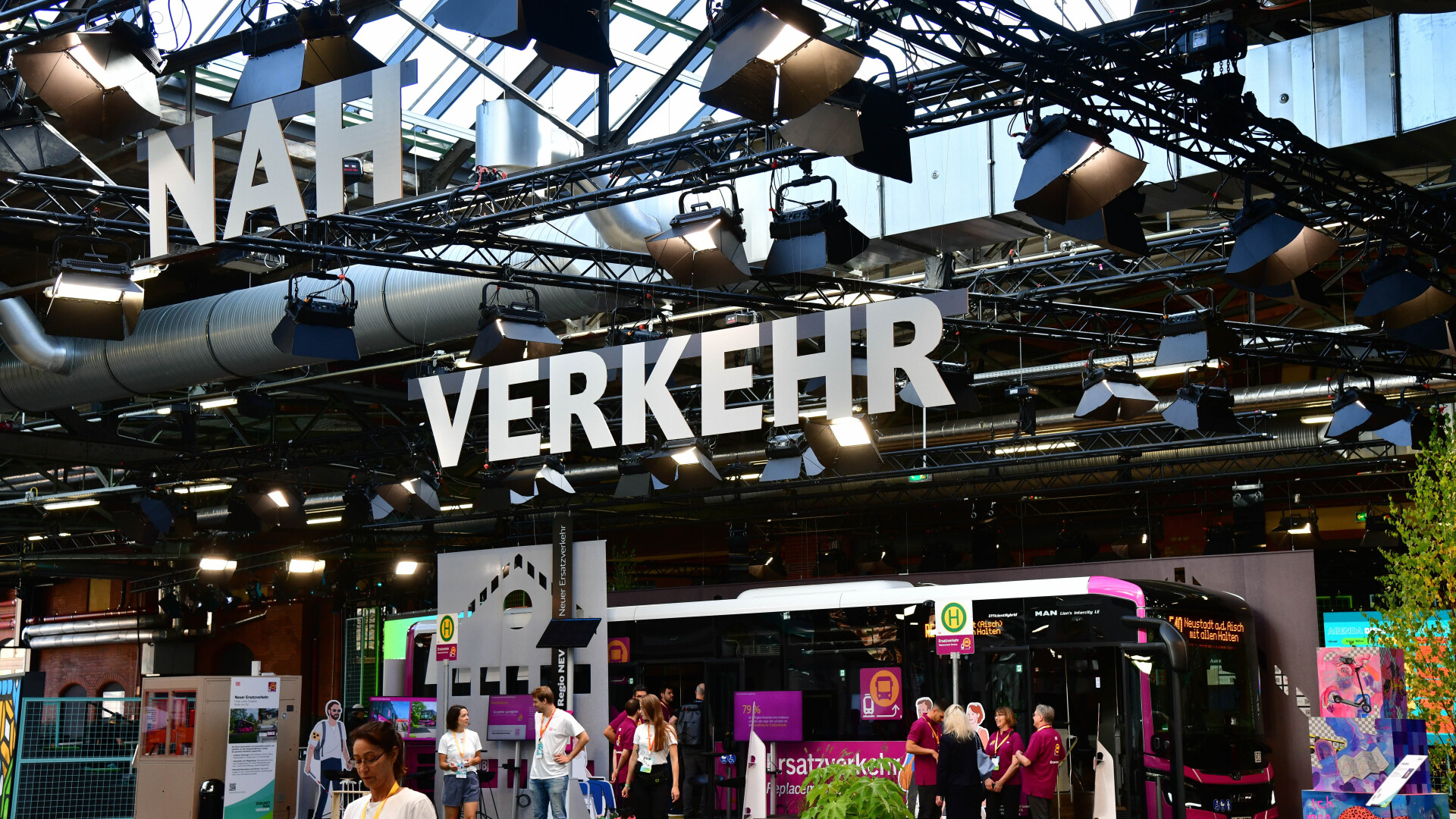
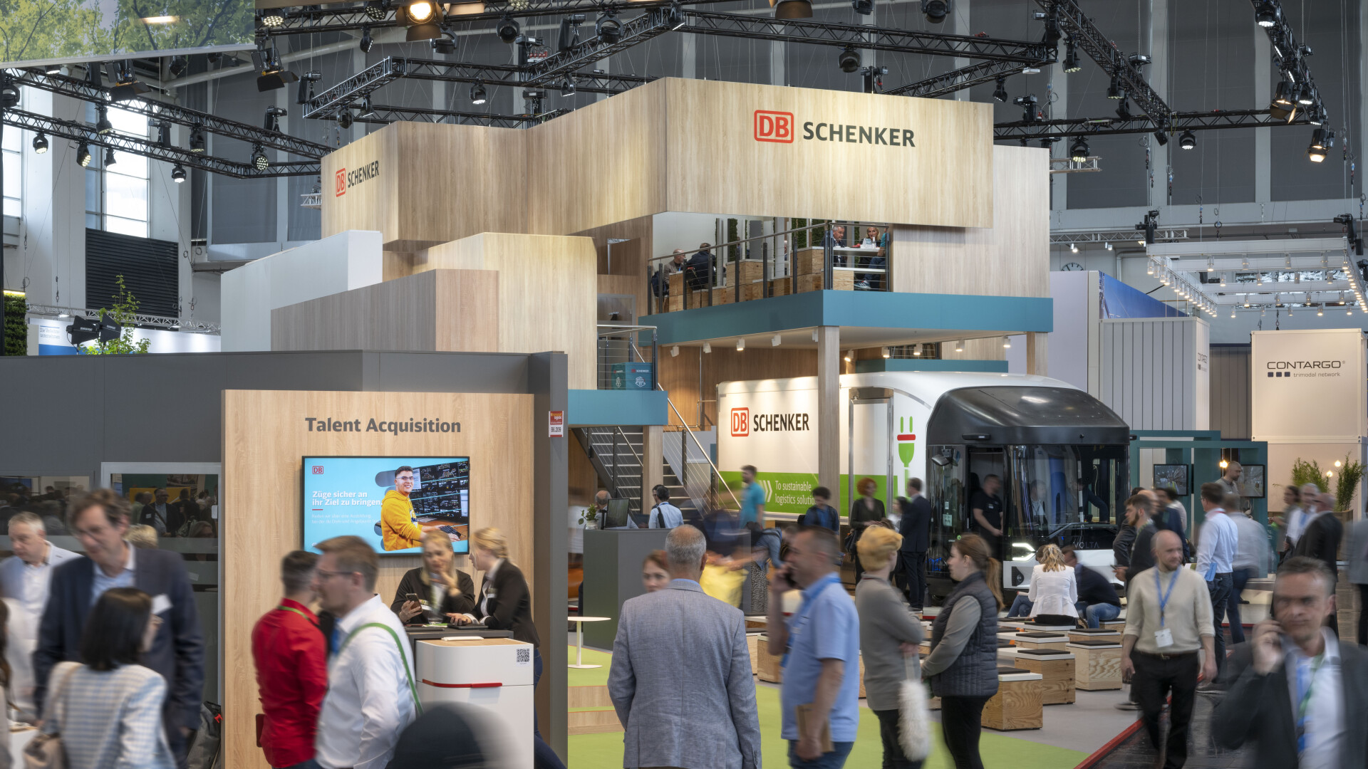
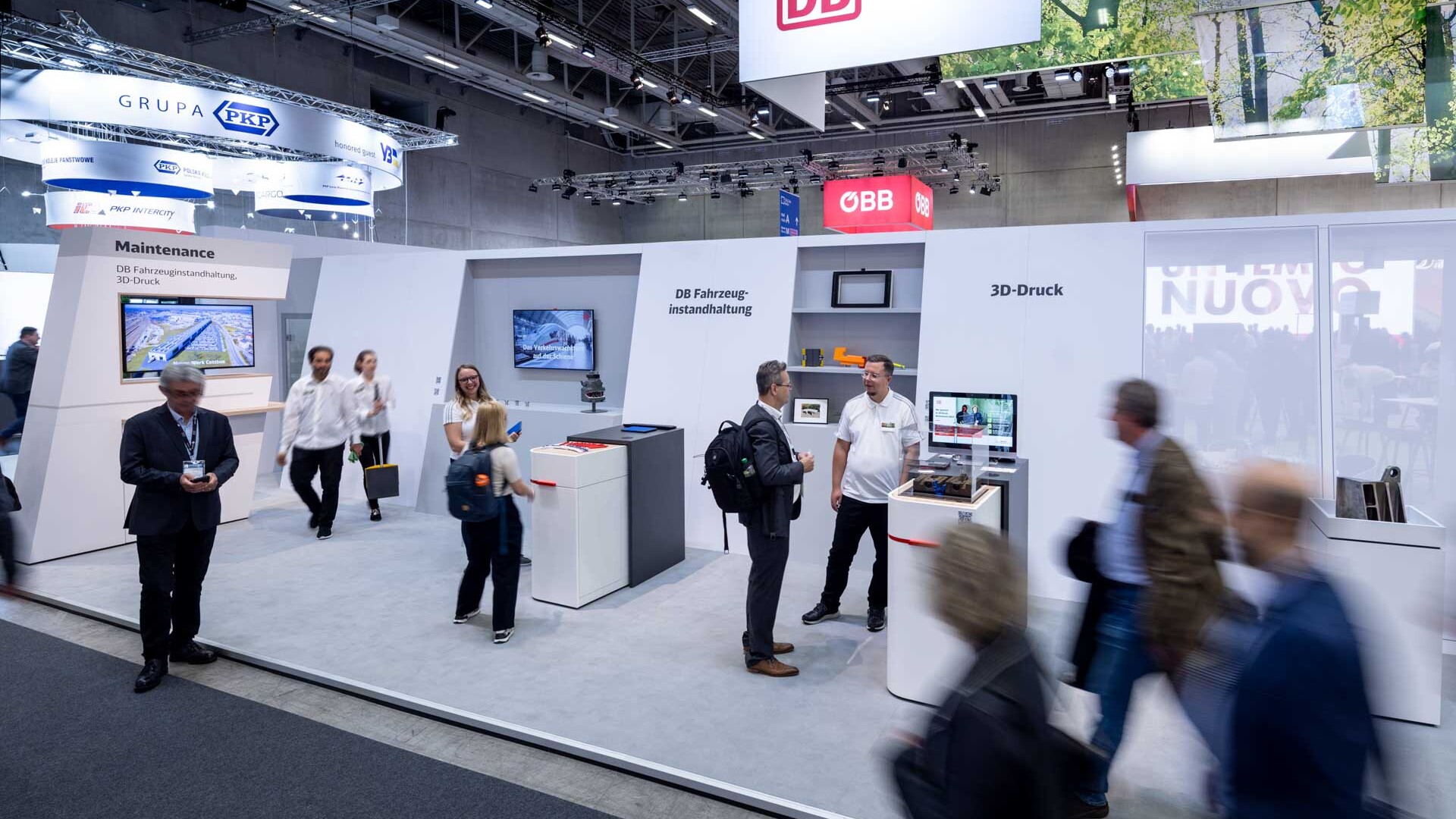
Our experts were the perfect choice for implementing the urban stand concept designed for DB by Nuremberg-based architecture firm querwärts ARCHITEKTEN. This progressive design presented the Deutsche Bahn brand as a champion of climate protection. The green central area was a key point of attraction, offering visitors a warm and welcoming atmosphere beneath the green canopy of the suspended forest.
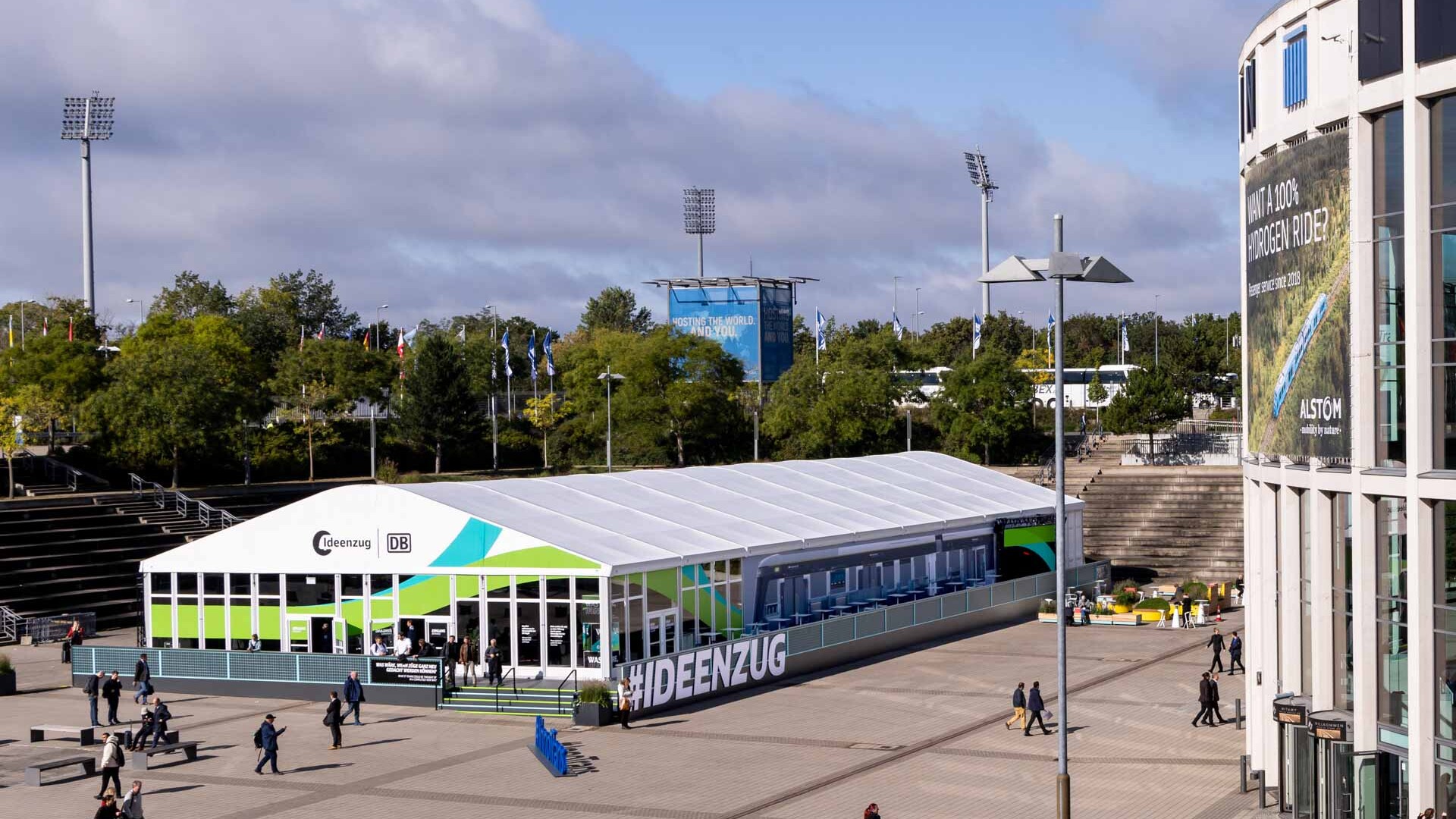
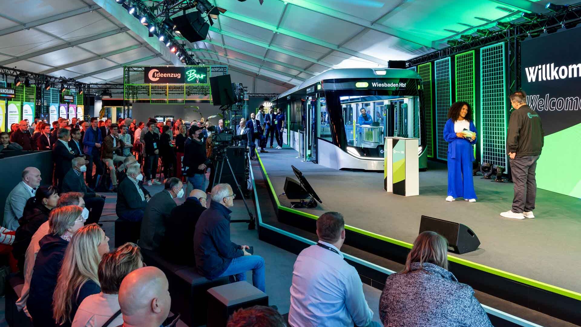
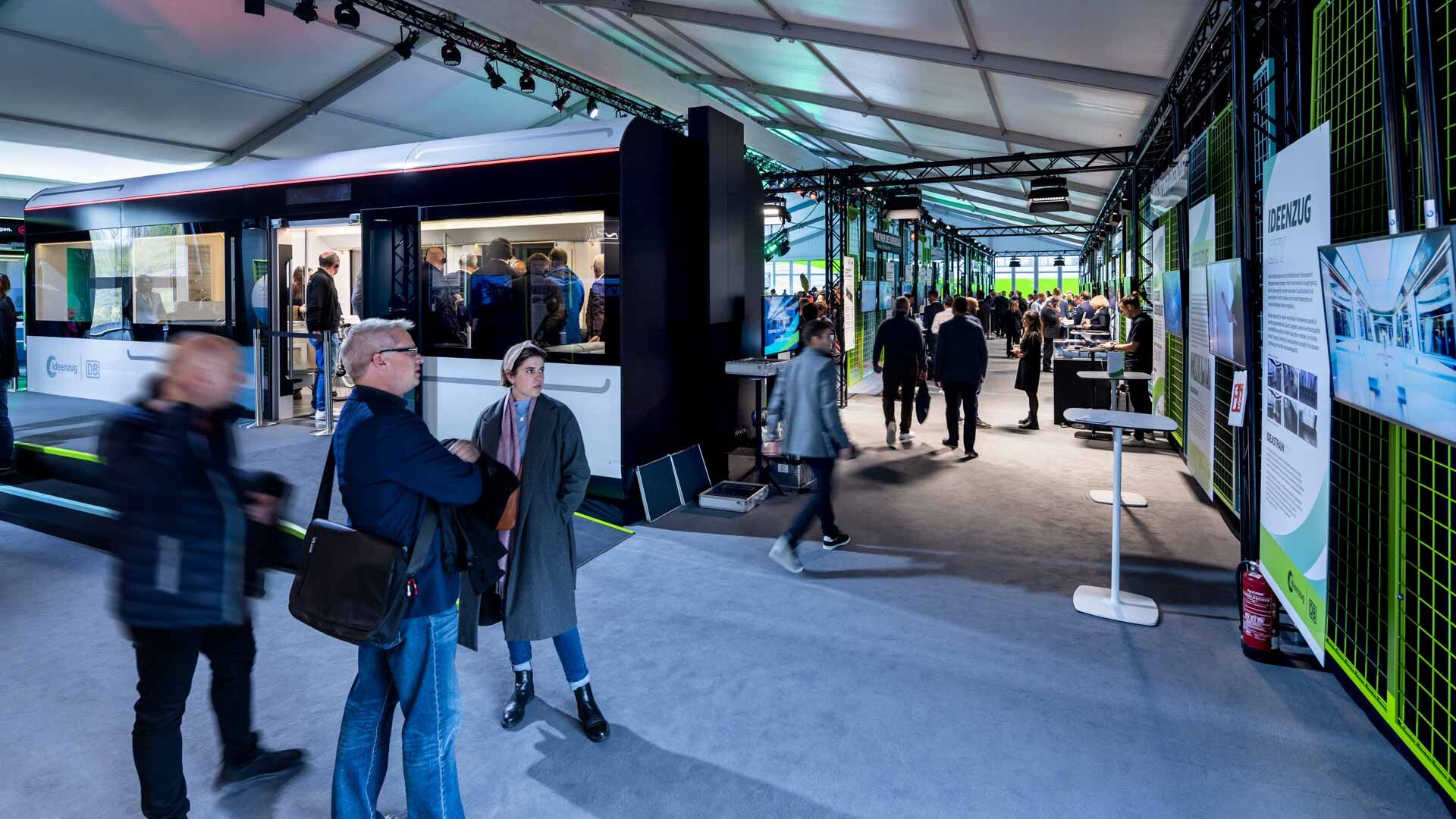
Outside, the “IdeasTrain” had pulled in. This communicative, experience-oriented concept – also designed by querwärts ARCHITEKTEN – presented the functional and comfortable train of the future. A total of 15 mock-up modules with a total weight of 45 tons were on display. And a completely redesigned color palette made for striking contrasts. All aboard for the future!
With MC2, I always know our high standards of quality will be met, and every project ends up hitting the mark perfectly. We have been working together for many years, building a strong relationship based on trust and mutual appreciation.

